Image Optimization
These instructions are for websites, banners, emails, heroes, monthly updates and anything else where a digital asset is needed.Improperly sized and unoptimized images can at best cause slow page/email/banner load times and at worst pile up and give us a low ranking score that the client will see and ding us for. One image might not break the bank overall, it may create a bad UX on one page, but if a site gets out of hand it will do so quickly and will load poorly and ultimately lead to bad experience, sales or feedback.Please follow these guidelines when creating images and designs for the web:
- Design at 72dpi. I’ve noticed a few email, infographic and other designs come through at higher DPIs than 72. This is not necessary for web development and only creates a large filesize. Please make sure Photoshop is set to 72dpi or if you output from AI or another program you’re getting 72dpi output.
- Design at exact dimensions. No doubling.All designs for the web should be at the exact dimensions. If an email is 700px wide, design at 700px wide, not 1400px. If a website is 1920px, design at 1920px. Doubling can be effective for iOS apps on retina screens (where the practice originated). However, for our current web and email development needs exact dimensions at 72DPI is perfect. Designing at larger sizes will only lead to slower performance and larger file sizes and potentially inaccurate programming and rendering reducing the quality of the final piece.
- Heroes for websites need to be no larger than 1920 wide. Obviously this depends on the design, but 1920x1080 should be plenty sufficient. If you’re working on a site, please ask around for templates. I have created PSD templates for all sorts of images and sizes on sites I’ve designed and developed. If there are no templates available, browse the site, find the image you’re looking for and use that (assuming it’s at the right specs). I’ve noticed on some sites that we’re uploading 1920x1080 (or larger even) images for sizes that only need something a fraction of that
- Select the right file format for what you’re doing: JPG, PNG or GIF. If you’re making a photo, JPG is best. Never a TIFF, BMP, PICT or other format (SVG is fine, but we’re talking raster images and not vector opportunities).
- Don’t rely on the CMS (e.g. WordPress) to optimize the image for you. Sure, it will create thumbnails that may or may not be used at different locations around the site (depending on the code), but the image you upload is your responsibility to optimize. E.g. Sugar and plastics — the main image that is uploaded is the one used on the site for heroes. Thumbnails are only used for callouts and article previews.
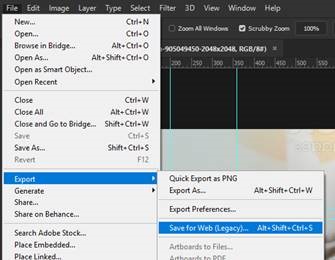
- Use save for web (legacy)
- If you have an icon, illustration or logo without crazy gradients or photo-like qualities, a PNG or GIF could work. Animation? GIF. If you’re developing the site, try SVGs for logos. You’ll never have to worry about “Fuzzy” feedback again because you’re using a vector for the logo.
- For JPGs, start with 65% optimized, go as high as 80 or as low as 25-35. Play around to find the best balance between quality and file size. Sometimes you can get away with a lot of compression (25% quality), sometimes you can’t (text in an image will create a lot of artifacts)
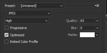
- Please pay attention to the file weight (kb size). A 1920x1080 hero JPG can be less than 100kb if you try. The more complex the image, the bigger it is, so sometimes it has to be 200-400kb. But not always. I just found a 400kb file and optimized it to 125kb.
- If you don’t need full transparency, and one color transparency can work, use an 8-bit PNG or a GIF. This would mainly be for buttons and other interface elements. Play around with dithering and palettes to see if you can optimize the file size. Compare PNG and GIF, sometimes one will win out. Sometimes even a JPG will beat it. You can probably get smaller illustrations, logos and elements down to a few KB or less.
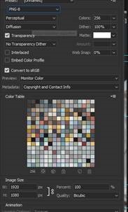
- If you need full transparency, use 24-bit PNG. But be sparing and thoughtful with this, as even optimized 24-BIT PNGs can be prohibitively large for the web.
- As a special note, if you’re creating an image that needs to match the colors found in a coded element, use a GIF. It can reproduce the color values to match the web color values perfectly. A JPG will try to compress the color value and it will shift. PNGs should be able to match as well.
- Lastly, you’re smarter than any optimization algorithm. Don’t rely on automatic optimization first. Do your best here to optimize and then double-check your work and reoptimize with https://tinyjpg.com/ https://tinypng.com/. Sometimes it can save you some more, but if you trust it first it has the potential to ruin the quality of the image (it won’t know if the text is blurry or the background looks off). You can tell what looks good (see Steps 7-9). However, these tools can be especially powerful when creating a 24-BIT PNG file and optimize what might have formerly been too large to effectively use to something you can use.
Was this post helpful?
Did you find what you were looking for? Is there anything that needs improvement?
Last modified: Friday, September 11, 2020 at 2:26 pm