CSS Grid
I'm in love with CSS Grid. Really truly. - Renee
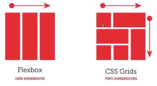
CSS Grid is the latest way to go about doing responsive grid layouts. How it excels vs. other methods is that CSS Grid allows for two dimensional layouts vs. one dimensional. And this gives us greater flexibility at solved layout issues with less code.
This is a 27 minute video that is a great introduction to CSS Grid and I highly recommend everyone watch it. It doesn’t cover off on everything but it shows just enough for you to grasp the concepts and see the value.
https://www.youtube.com/watch?v=jV8B24rSN5o
This is a little longer video (44 mins) but its also really good. I recommend this video specifically for Kara/Adrian who do not work as closely to the code as I do because it gives a real-life example of a website using CSS Grid which will help you visualize the concepts better. (also, fun fact, the speaker in this video does a lot of the Lynda.com/LinkedIn Learning PHP/Wordpress videos I have been watching).
https://www.youtube.com/watch?v=txZq7Laz7_4
This is a nice reference guide to bookmark as use for later:
https://css-tricks.com/snippets/css/complete-guide-grid/
I can already see CSS Grid solving problems I have had at Marriner such as when I want to reorder the position of elements for mobile, solving having way too many nested divs, solving when I want columns to be the same height without setting a fixed height or using JS, solving overlap items.
What about Flexbox? -says Tim
OK, yes. Flexbox is also pretty cool and I cant definitely say CSS Grid solves all problems.
In this video a lovely lady compares them briefly and I think she says it best when she says when choosing Flexbox or CSS Grid “Which one has the super powers you need at that moment”.
https://www.youtube.com/watch?v=hs3piaN4b5I
Was this post helpful?
Did you find what you were looking for? Is there anything that needs improvement?
Last modified: Friday, June 7, 2019 at 11:00 am